B2B Marketplace / Cross-Platform UX
One marketplace. Many journeys. A shared system.
A cross-platform interface revamp connecting competitive research, journey mapping and reusable UI across IndiaMART's apps, mobile web and desktop.
Inside the engagement- Client
- IndiaMART
- Market
- India / B2B marketplace
- Engagement
- Competitive benchmarking / Cross-platform journeys
- Delivery
- Redesign, template proposal and expert evaluation documented
01 / The business context
A dense marketplace, spread across many surfaces.
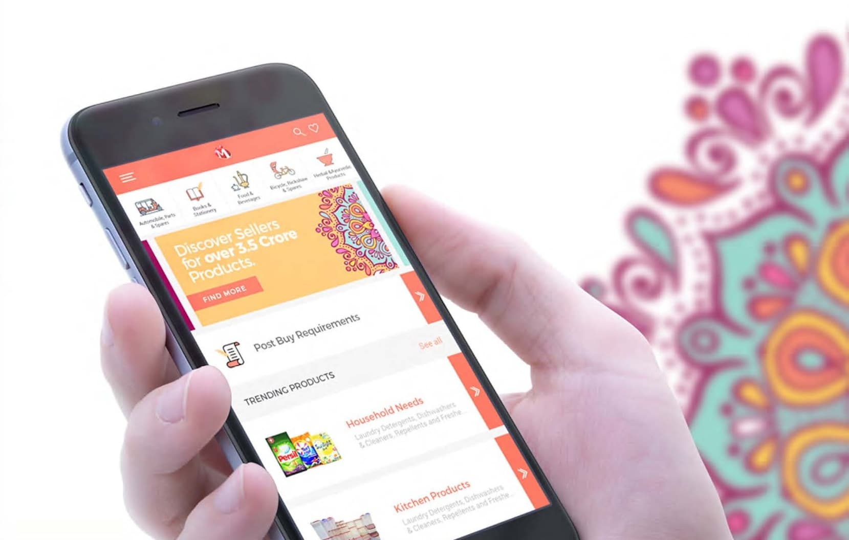
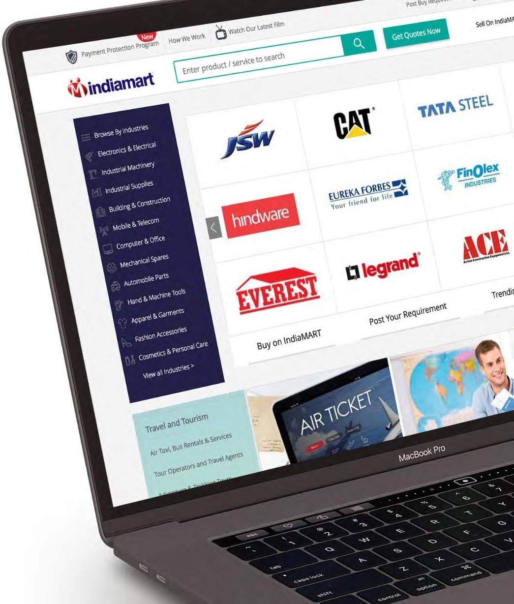
IndiaMART brings buyers and suppliers together across Android and iOS apps, a mobile website and a desktop website. Tasks had to stay coherent across very different screen sizes while an information-dense interface competed for attention. The brief covered a UI/UX revamp of those surfaces, alongside communication strategy and mailer design, with a clear objective: improve hierarchy, simplify navigation and establish one cohesive visual language.
02 / The strategic direction
Start from evidence, not aesthetics. Benchmark how comparable marketplaces organise products and guide action, translate the friction into named opportunities, then express those decisions through a reusable interface language that holds together across platforms.
03 / From intent to execution
The decisions that shaped the work.
Benchmark, then define priorities
Competitive analysis of Alibaba, eBay and Amazon framed IndiaMART's own challenges: information overload, complex navigation, inconsistent iconography and unclear action cues. Each observed concern was mapped to an opportunity and a concrete design response rather than a general redesign.
Make the routes through the product explicit
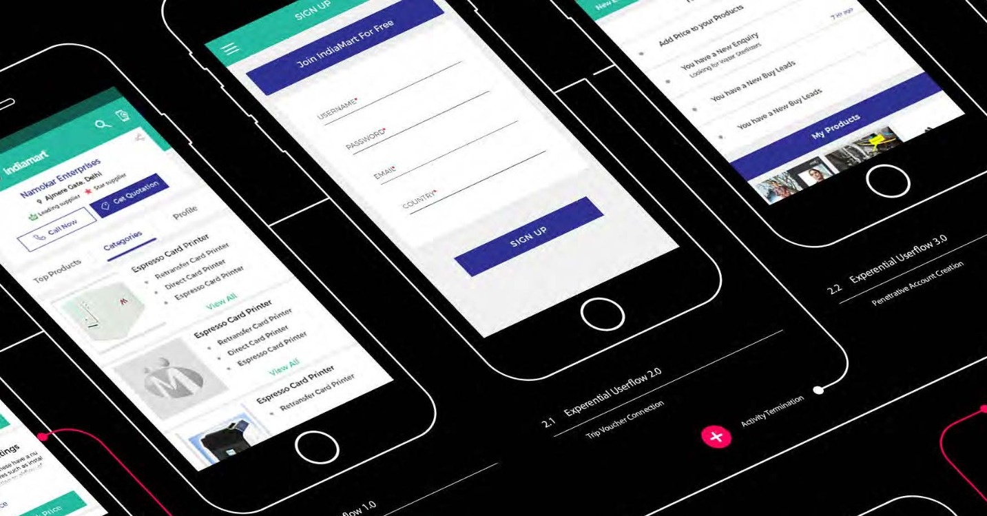
Journey studies covered supplier discovery, account entry and enquiries. A single scenario — a buyer moving from a product need to a supplier enquiry, through discover, evaluate, contact and continue — was used as a lens to check hierarchy at each step, the visibility of the next action and continuity between screens.
Reduce effort at the point of action
The interaction principles made the primary action legible within a dense interface, kept navigation and field patterns predictable so users relearn less, and respected input context on mobile. Reach and precision were treated as design constraints, not afterthoughts.
Build a language that can scale
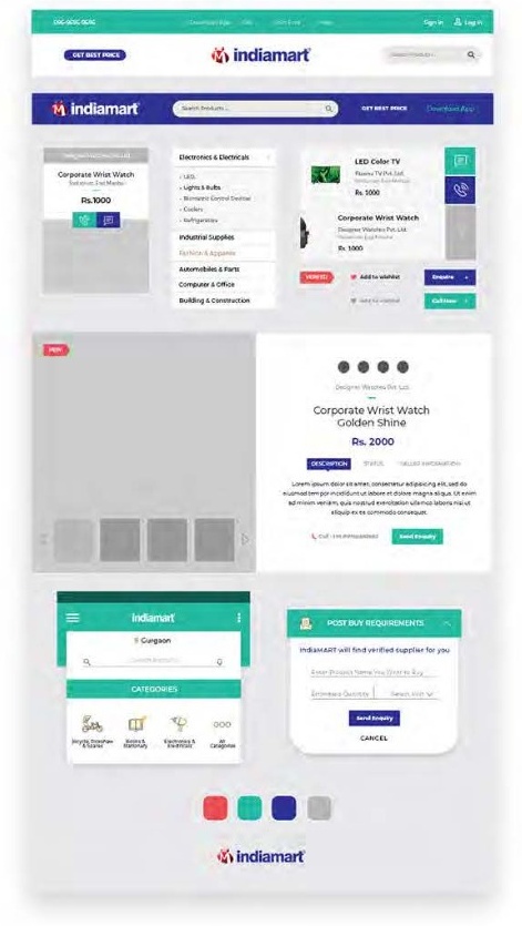
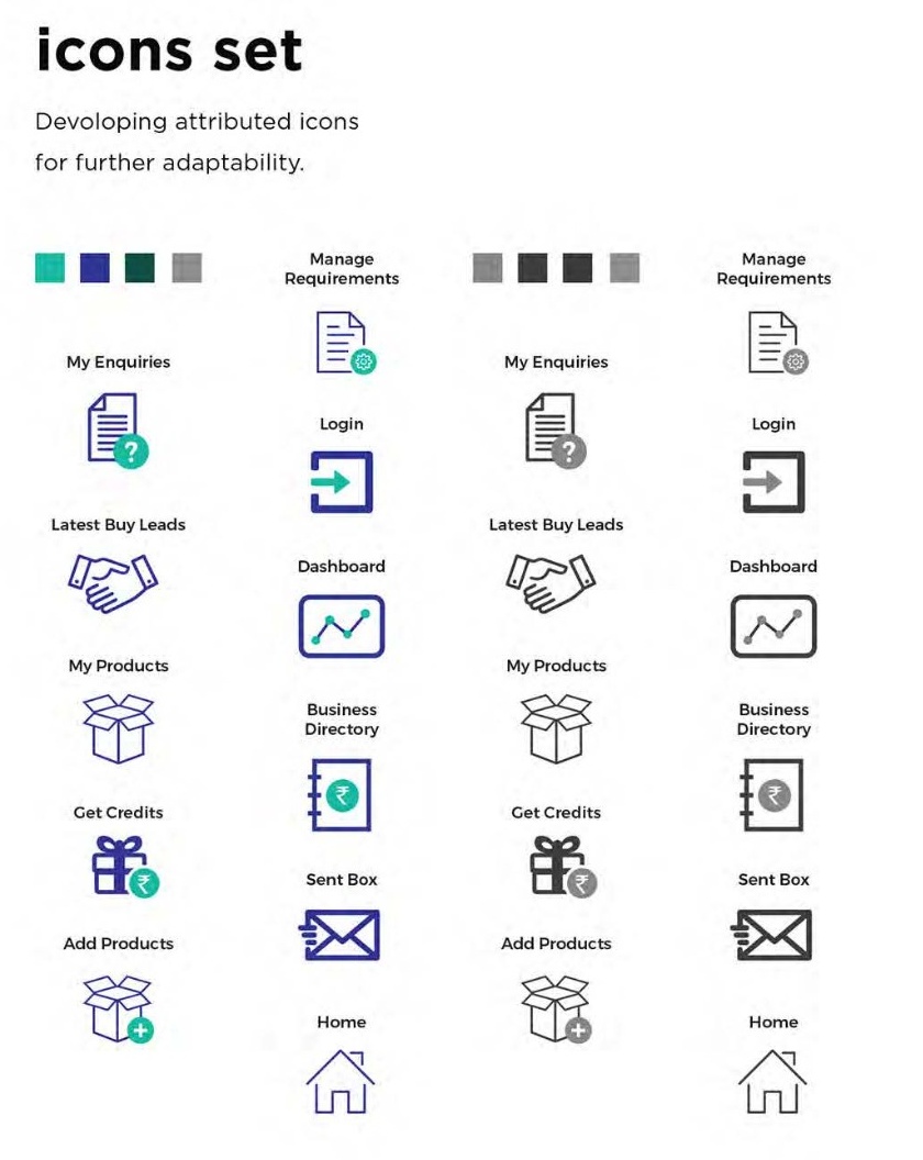
Foundations of colour, typography and an adaptable icon set fed reusable components — navigation, product cards, fields and actions — assembled into compositions for different tasks and screen sizes. Atomic Design gave the marketplace a consistent, repeatable system instead of one-off screens.
04 / Selected project detail
See the thinking take shape.
05 / Delivery & outcome
Redesign, template proposal and expert evaluation documented.
The documented work connects competitive research, journey architecture, interaction principles and an Atomic Design system across IndiaMART's apps, mobile web and desktop. A separate assignment evaluated selected desktop and mobile screens through a layout, interaction and visual-affordance lens, and a culturally expressive "Love for India" visual concept explored a more emotional creative direction.
Based on the supplied IndiaMART case study and its original portfolio visuals. The engagement spanned a core redesign, a template proposal and an expert evaluation as distinct assignments, and the project was subsequently placed on hold. The "Love for India" visual is a concept direction, not evidence of a released or validated outcome, and the record does not establish a production launch or quantified usability gains.
Your next chapter
Bring one coherent system to a complex marketplace.
Tell us about your audience, the challenge and what success needs to look like. We can help define the right scope.